Start by photographing your home’s exterior at different times of day to identify whether your siding, brick, or stone carries warm or cool undertones. You’ll want to match warm-toned exteriors with deck stains featuring red or brown undertones, while cool gray siding pairs best with weathered driftwood or slate finishes. Test physical samples against your home for at least three days before deciding. Below, you’ll discover how architectural style, climate, and seasonal changes should shape your final choice.
Understanding Your Home’s Exterior Color Palette
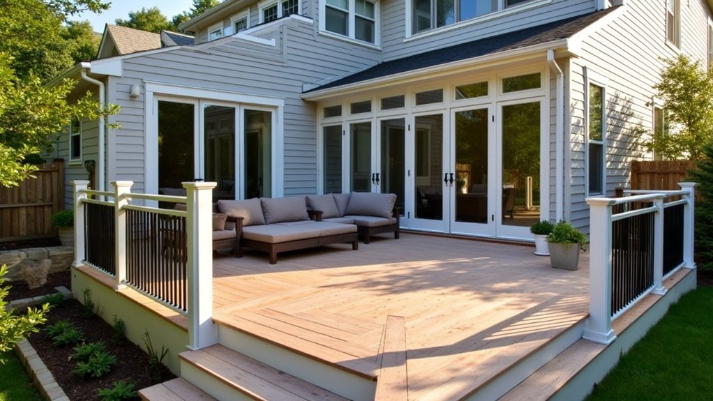
When you’re selecting a deck color, your home’s existing exterior serves as the foundation for every decision you’ll make.
Your home’s exterior is the starting point—every deck color decision flows from what’s already there.
Take time to identify the dominant colors in your siding, trim, shutters, and roof. These elements create a visual framework that your deck must complement.
Step outside and photograph your home at different times of day. Natural lighting shifts how colors appear, and you’ll want a deck shade that works in morning sun and evening shadow alike.
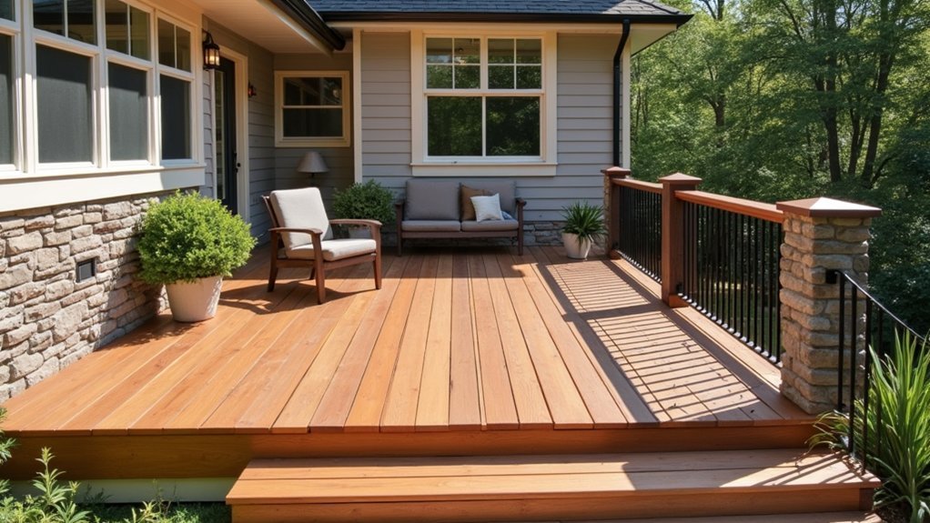
Consider whether your home features warm or cool undertones. Brick with orange hues pairs best with warm-toned decking, while gray siding coordinates naturally with cooler wood stains.
Don’t forget your landscaping—green foliage, flowering plants, and hardscape materials all influence which deck colors will create visual harmony.
Analyzing Architectural Style and Era
Because your home’s architectural style carries distinct historical associations, the deck colors you choose should honor that heritage rather than fight against it. A Victorian home demands different tones than a mid-century modern ranch, and ignoring these distinctions creates visual discord.
| Architectural Style | Recommended Deck Colors |
|---|---|
| Victorian | Deep burgundy, forest green, charcoal |
| Craftsman | Warm browns, olive, terra cotta |
| Mid-Century Modern | Gray tones, natural cedar, white |
| Colonial | Classic reds, navy accents, warm wood |
You’ll want to research your home’s era to understand what materials and colors were prevalent during that period. This doesn’t mean you’re locked into historical accuracy, but your choices should complement rather than contradict your home’s character. Consider consulting architectural preservation resources for guidance.
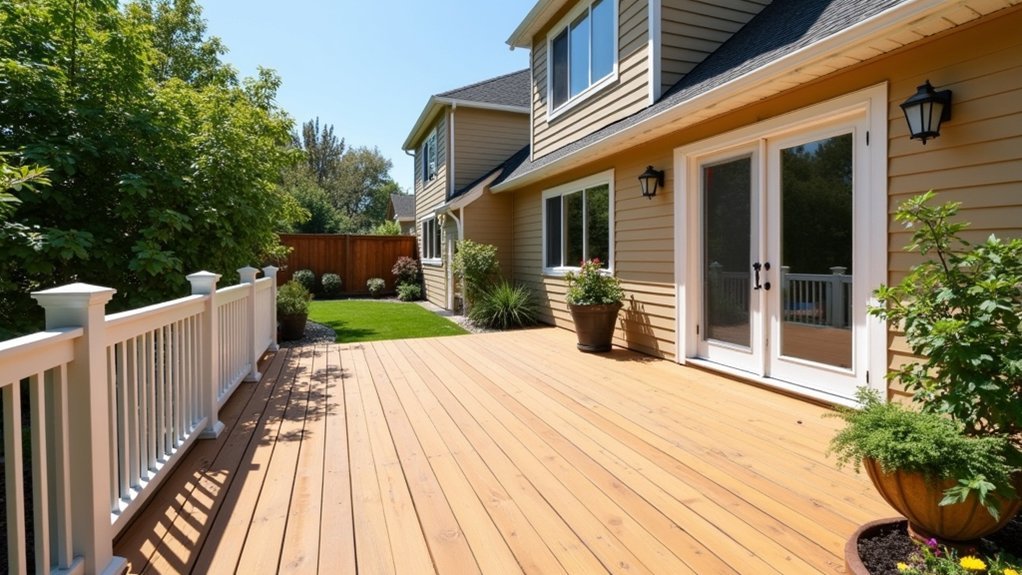
Working With Brick, Stone, and Siding Materials
Your home’s exterior materials contain undertones that will either harmonize with or clash against your deck color choice. Brick often carries warm red, orange, or yellow undertones, while stone ranges from cool grays to warm beiges. Vinyl and fiber cement siding present their own color temperatures that demand consideration.
Every exterior material carries hidden undertones—identify them before choosing your deck color to ensure visual harmony.
To identify your material’s undertones, follow these steps:
- Hold potential deck samples against your exterior in natural daylight at different times
- Look for the secondary colors hiding within your brick or stone—these subtle hues determine compatibility
- Photograph your materials and adjust saturation to reveal hidden undertones
Match warm-toned exteriors with decking that shares similar warmth. Pair cool gray stones with composite boards featuring gray or blue undertones. This strategic alignment creates visual cohesion between your deck and home.
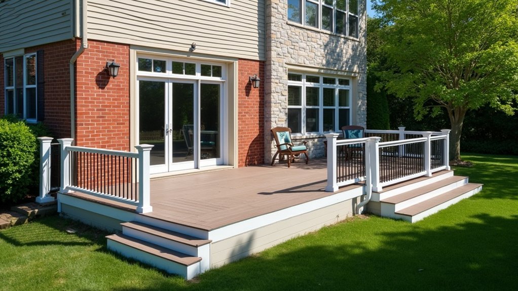
Considering Roof Color in Your Deck Design
Though often overlooked during deck planning, your roof color materially influences which decking shades will look best from street level. Your deck and roof create a visual frame for your home, so these elements should complement rather than compete with each other.
If you have a dark charcoal or black roof, you can confidently choose either light or dark decking. Gray or brown roofs offer similar flexibility but work especially well with warm-toned deck boards. Terra cotta or red-tinted roofs pair naturally with earthy browns and tans.
Stand across the street and photograph your home before selecting deck samples. This perspective reveals how your roof color interacts with other exterior elements. Bring your top deck choices outside and view them from this same distance to secure cohesive results.
Coordinating With Trim and Accent Colors
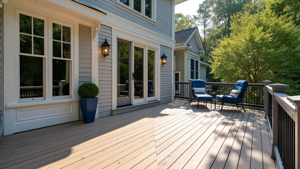
Your deck should work harmoniously with your home’s existing trim and accent colors for a cohesive look.
Start by matching your window trim color, then echo the hues found in your shutters to create visual continuity from house to deck.
You’ll also want to complement your door finishes, whether that means picking up undertones or choosing a shade that sits well alongside your entry’s color palette.
Match Your Window Trim
When you’re searching for the perfect deck color, why not look to your home’s existing window trim for inspiration? This often-overlooked design element provides a ready-made color palette that’s already proven to complement your home’s exterior.
Window trim creates visual continuity between your home’s architectural features. By selecting a deck stain or paint that echoes these tones, you’ll achieve a cohesive, intentional look.
Here are three approaches to try:
- Match exactly – Choose a deck color identical to your trim for a unified appearance.
- Go complementary – Select a shade two to three tones lighter or darker than your trim.
- Use as accent – Incorporate the trim color into deck railings or stairs while choosing a neutral base.
This strategy eliminates guesswork and guarantees a polished result.
Echo Shutter Colors
Shutters bring bold personality to your home’s facade, and you can play off these accent colors to create a stunning deck design.
When your shutters feature deep navy, forest green, or burgundy tones, you’ve got a built-in color palette to reference for your outdoor space.
Select deck stain or composite colors that complement rather than compete with your shutters. If you have black shutters, consider a warm cedar or honey-toned deck that creates appealing contrast. Green shutters pair beautifully with rich mahogany or redwood hues.
You can also match your deck railing or post caps directly to your shutter color for a cohesive look that ties your entire property together. This approach works especially well when you want your deck to feel like a natural extension of your home.
Complement Door Finishes
Just as shutters offer color cues for your deck design, entry doors and trim provide another valuable reference point. Your door’s finish creates an opportunity to build a cohesive exterior palette that ties your outdoor living space together.
Consider these three approaches when coordinating your deck with door finishes:
- Match warm tones – If you’ve got a wood-grain or bronze door, select deck boards with similar warm undertones like cedar or redwood hues.
- Create intentional contrast – Pair a bold red or navy door with neutral gray decking to let your entrance stand out.
- Unify through trim – Use your white or cream trim color as a bridge, incorporating it into deck railings or border accents.
This strategy guarantees your deck feels like a natural extension of your home’s design.
Exploring Wood Stain Options for Natural Appeal
When you want to preserve your deck’s natural wood grain, you’ll need to choose between transparent stains that showcase the wood’s character and solid stains that provide more uniform coverage.
Your selection should complement your home’s exterior tones, whether you’re matching warm brick facades or cool-toned siding.
Popular wood stain colors range from honey-toned cedars and rich walnut hues to weathered gray finishes that create a coastal aesthetic.
Transparent vs. Solid Stains
Stain options break down into two main categories that dramatically affect your deck’s final appearance: transparent and solid formulations.
Transparent stains let the wood’s natural grain shine through while adding subtle color enhancement and UV protection. You’ll see every knot, streak, and unique characteristic of your lumber.
These work best on new or well-maintained decks with attractive wood patterns.
Solid stains function more like paint, completely covering the grain with opaque color.
They’re ideal for hiding imperfections, mismatched boards, or weathered wood.
Consider these factors when choosing:
- Wood condition — newer decks suit transparent stains; older decks benefit from solid coverage
- Maintenance commitment — transparent stains require reapplication every 1-2 years; solid stains last 3-5 years
- Aesthetic preference — natural wood lovers choose transparent; uniform color seekers prefer solid
Matching Home Exterior Tones
Your deck shouldn’t clash with your home’s exterior—it should complement it. Pull colors directly from your siding, trim, shutters, or roof to create visual harmony. If your home features warm brick tones, choose stains with red or brown undertones. Cool gray siding pairs well with weathered driftwood or slate-toned finishes.
Consider your home’s architectural style when selecting stain intensity. Traditional homes often look best with classic brown wood tones, while modern designs can handle bolder grays or charcoal shades. Don’t forget to factor in your landscaping—lush greenery makes natural cedar tones pop, while desert landscapes suit warmer honey shades.
Test multiple stain samples on your actual deck boards. View them at different times throughout the day, since shifting sunlight dramatically changes how colors appear against your exterior.
Popular Wood Stain Colors
Although countless stain options exist on the market, a handful of timeless colors consistently dominate homeowner choices. You’ll find these natural tones complement most architectural styles while enhancing wood’s inherent beauty.
Here are three popular wood stain colors worth considering:
- Cedar – This warm, reddish-brown shade works beautifully with earth-toned exteriors and creates a welcoming atmosphere.
- Walnut – A rich, deep brown that adds sophistication and pairs excellently with traditional homes featuring darker trim.
- Natural Oak – This lighter golden hue preserves wood’s organic appearance while providing essential protection from the elements.
When selecting your stain, you should test samples on your actual deck boards. Natural lighting dramatically affects how colors appear, so observe your choices during different times of day before committing.
Composite Decking Color Trends and Choices
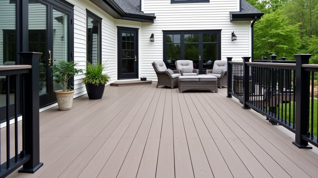
When you’re exploring composite decking options, you’ll find manufacturers have dramatically expanded their color palettes beyond the basic browns and grays of early products. Today’s composites mimic exotic hardwoods, weathered barn wood, and coastal driftwood with remarkable accuracy.
Current trends favor multi-tonal boards that blend several shades within each plank, creating depth and visual interest that solid colors can’t match. Warm tones like teak and walnut remain popular, while cool grays and charcoal shades dominate modern home designs.
You should request physical samples before committing to a color. Composite materials look different in natural sunlight than under showroom lighting. Place samples against your home’s siding and observe them at various times throughout the day to make certain you’re making the right choice.
Creating Contrast Versus Complementary Schemes
When selecting your deck colors, you’ll need to decide between bold contrast pairings and harmonious complementary tones.
Bold contrasts—like pairing dark walnut boards with crisp white railings—create visual drama and define architectural elements. Alternatively, complementary schemes use colors within the same family to produce a cohesive, unified outdoor space that feels naturally balanced.
Bold Contrast Color Pairings
While subtle color schemes create harmony, bold contrast pairings make your deck a striking focal point that commands attention. You’ll achieve maximum visual impact by pairing opposites on the color wheel or combining dramatically different tones.
Consider these proven bold contrast combinations:
- Charcoal gray deck with crisp white trim – This pairing delivers modern sophistication against any home exterior.
- Deep mahogany stain with sage green accents – Natural warmth meets cool tones for dynamic visual tension.
- Black deck boards with warm cedar railings – The stark difference creates architectural interest and depth.
When you’re choosing bold contrasts, make certain one color dominates while the other accents. This prevents visual chaos and maintains balance. Test your selections in different lighting conditions before committing.
Harmonious Complementary Tones
Harmonious complementary tones dial back the drama while still delivering visual interest to your deck design. Instead of stark contrasts, you’re selecting colors that sit adjacent to each other on the color wheel or share similar undertones.
Consider pairing a warm gray deck with your taupe-sided home, or match honey-toned wood with cream trim. These combinations create a cohesive flow that feels intentional without demanding attention.
You’ll want to pull colors directly from existing elements—your roof shingles, stone accents, or window frames. This approach anchors your deck to the overall property aesthetic.
Test your selections by placing deck samples against your home’s exterior at different times of day. Subtle color relationships shift dramatically under changing light conditions, so verify your choices before committing.
Factoring in Landscape and Garden Elements
Your deck doesn’t exist in isolation—it sits within a broader outdoor environment that includes trees, shrubs, flower beds, and lawn areas. Consider how your color choice will interact with these natural features throughout the seasons.
When evaluating your landscape, focus on these key considerations:
- Dominant foliage colors – Green-heavy gardens pair well with warm wood tones, while varied plantings can handle bolder deck colors.
- Seasonal changes – Account for autumn leaves, winter dormancy, and spring blooms when selecting your palette.
- Hardscape materials – Coordinate with existing stone pathways, retaining walls, or water features nearby.
Take photos of your yard during different seasons and times of day. You’ll spot color relationships that inform smarter deck decisions.
Testing Samples in Different Lighting Conditions
Deck stain samples often look dramatically different once you take them outside and view them under natural light. Apply your top color choices to scrap wood pieces and place them directly on your existing deck surface. Observe how each sample appears during morning, midday, and evening hours, as sunlight shifts color temperature throughout the day.
Don’t forget to check your samples on cloudy days too. Overcast conditions reveal undertones you might miss in direct sunlight. Position samples near your home’s siding, trim, and any landscaping features you’ve already considered. Watch how shadows from trees or structures affect the appearance.
Give yourself at least three full days of observation before making your final decision. This patience prevents costly mistakes and guarantees you’ll love your deck’s new color year-round.
Balancing Deck Railings and Board Colors
Once you’ve settled on a deck board color through careful observation, you’ll need to contemplate how your railings will complement that choice. The interplay between these two elements defines your deck’s overall aesthetic impact.
Consider these three proven approaches for achieving visual harmony:
- Contrast method: Pair dark boards with white or light-colored railings to create striking definition and draw the eye upward.
- Monochromatic method: Select railings in the same color family as your boards for a seamless, unified appearance.
- Complementary method: Choose railings that match your home’s trim or accent colors, creating a bridge between your deck and house.
Don’t overlook metal railing options in black, bronze, or silver—they offer durability while providing neutral tones that work with virtually any board color.
Seasonal and Climate Considerations for Color Selection
Understanding how sunlight, temperature, and weather patterns affect your deck’s appearance throughout the year plays a crucial role in selecting the right color.
Dark colors absorb more heat, making surfaces uncomfortably hot during summer months in warm climates. If you live in a sunny region, lighter shades keep your deck cooler underfoot.
Consider how seasonal changes affect color perception. Snow-covered landscapes make dark decks stand out dramatically, while lighter tones blend seamlessly.
In rainy climates, darker colors hide water stains and algae growth better than pale options.
UV exposure fades colors over time, with reds and browns showing wear faster than grays or earth tones. You’ll want fade-resistant stains if your deck receives direct sunlight for extended periods.
Match your color choice to your local climate for lasting satisfaction.
Frequently Asked Questions
How Often Will I Need to Refinish or Restain My Deck Color?
You’ll typically need to refinish or restain your deck every two to three years, depending on weather exposure, foot traffic, and the stain type you’ve chosen. Regular maintenance helps preserve your deck’s appearance and protection.
Can I Paint Over an Existing Stained Deck With a Different Color?
Yes, you can paint over a stained deck, but you’ll need to sand the surface thoroughly, clean it well, and apply a primer designed for stained wood before adding your new paint color.
Will My Deck Color Affect the Resale Value of My Home?
Yes, your deck color can affect resale value. You’ll attract more buyers by choosing neutral tones that complement your home’s exterior. Bold or unusual colors might limit appeal, so you should consider timeless options.
How Do I Remove Old Deck Stain Before Applying a New Color?
You’ll need to pressure wash your deck first, then apply a chemical stain stripper with a brush. Let it sit according to directions, scrub thoroughly, and rinse clean before sanding any remaining stubborn spots.
Does Deck Color Affect Surface Temperature in Direct Sunlight?
Yes, deck color markedly affects surface temperature. Darker colors absorb more heat, making your deck uncomfortably hot underfoot during summer. You’ll find lighter shades stay cooler, which is especially important if you’re walking barefoot.


Leave a Reply